Overview
YEO's is a leading brand of soymilk in China, extremely popular among housewives and families on the mainland. The company decided to launch a new product line design to appeal to the younger generation, with a view to expanding their reach to people of all ages and revitalizing the YEO's brand.
Challenge
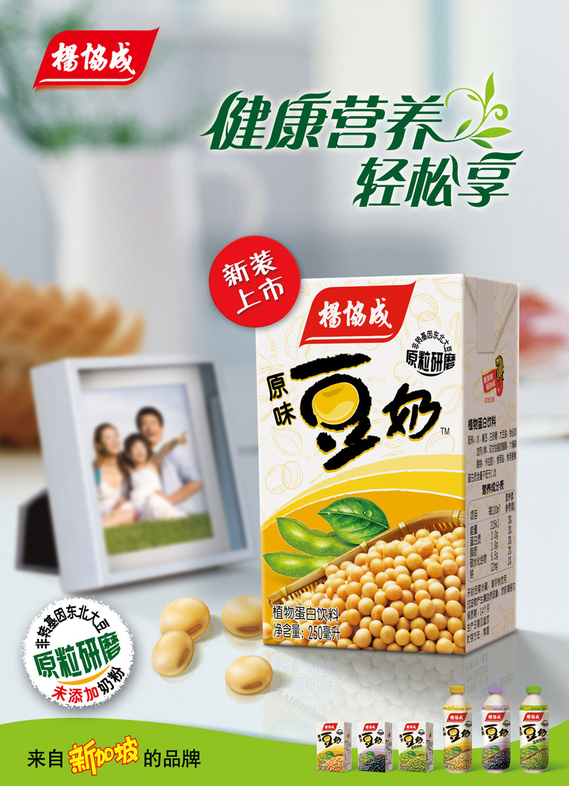
Bamboo Design was approached to develop a dynamic packaging design for YEO's new soymilk products, ensuring optimal visual impact on the supermarket shelf while maintaining the brand’s original look and feel. The company wanted to promote a natural, nutritious and healthy image to young urbanites aged between 20-30 years old.
Solution
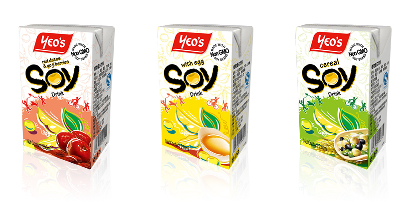
Using the simple image of a soybean, we designed an exclusive icon for soymilk that showcased the companies whole-bean-grinding technology, writing the product name with a paintbrush to depict a vibrant, youthful feel. We also featured images that personify a healthy, outdoor lifestyle, carefully selecting a color palette that would easily differentiate YEO's products on the shelf.

YEO's Soy Drink
Client: YEO's
Bamboo Design was tasked with developing a dynamic packaging design for YEO's new soymilk products, ensuring optimal visual impact while maintaining the brand's original look and feel.